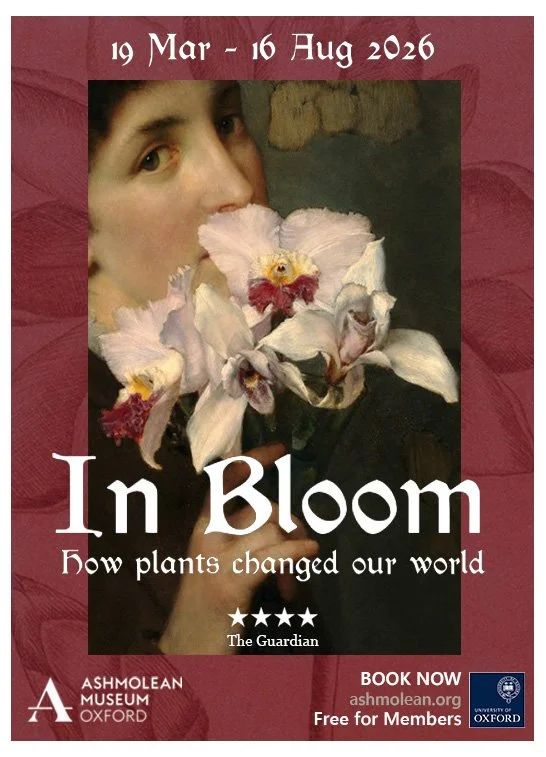
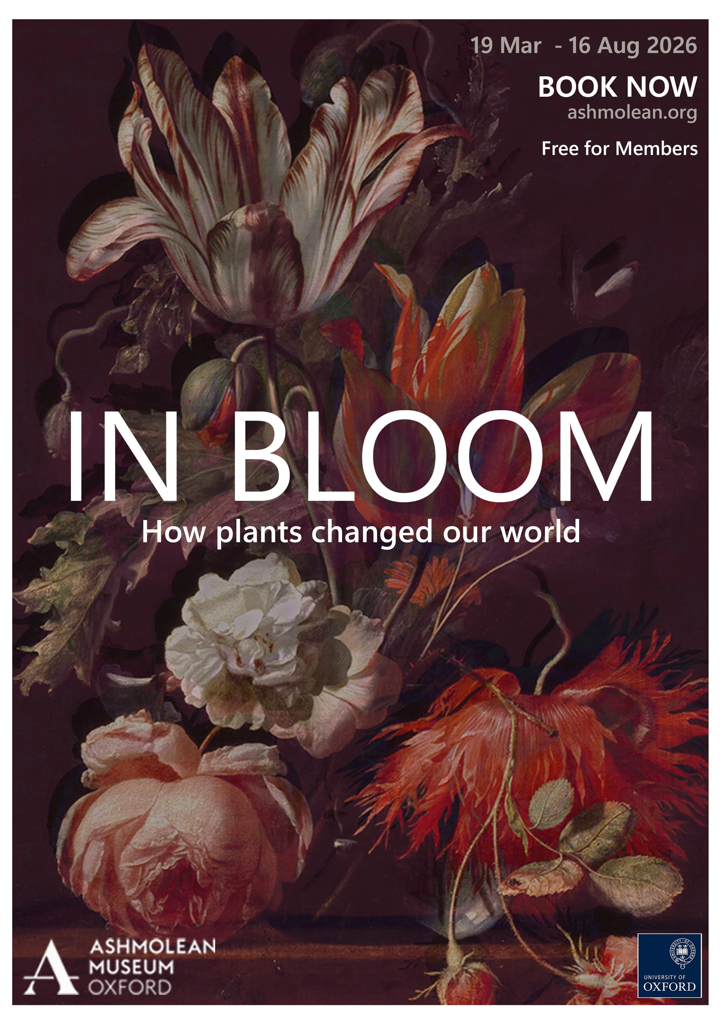
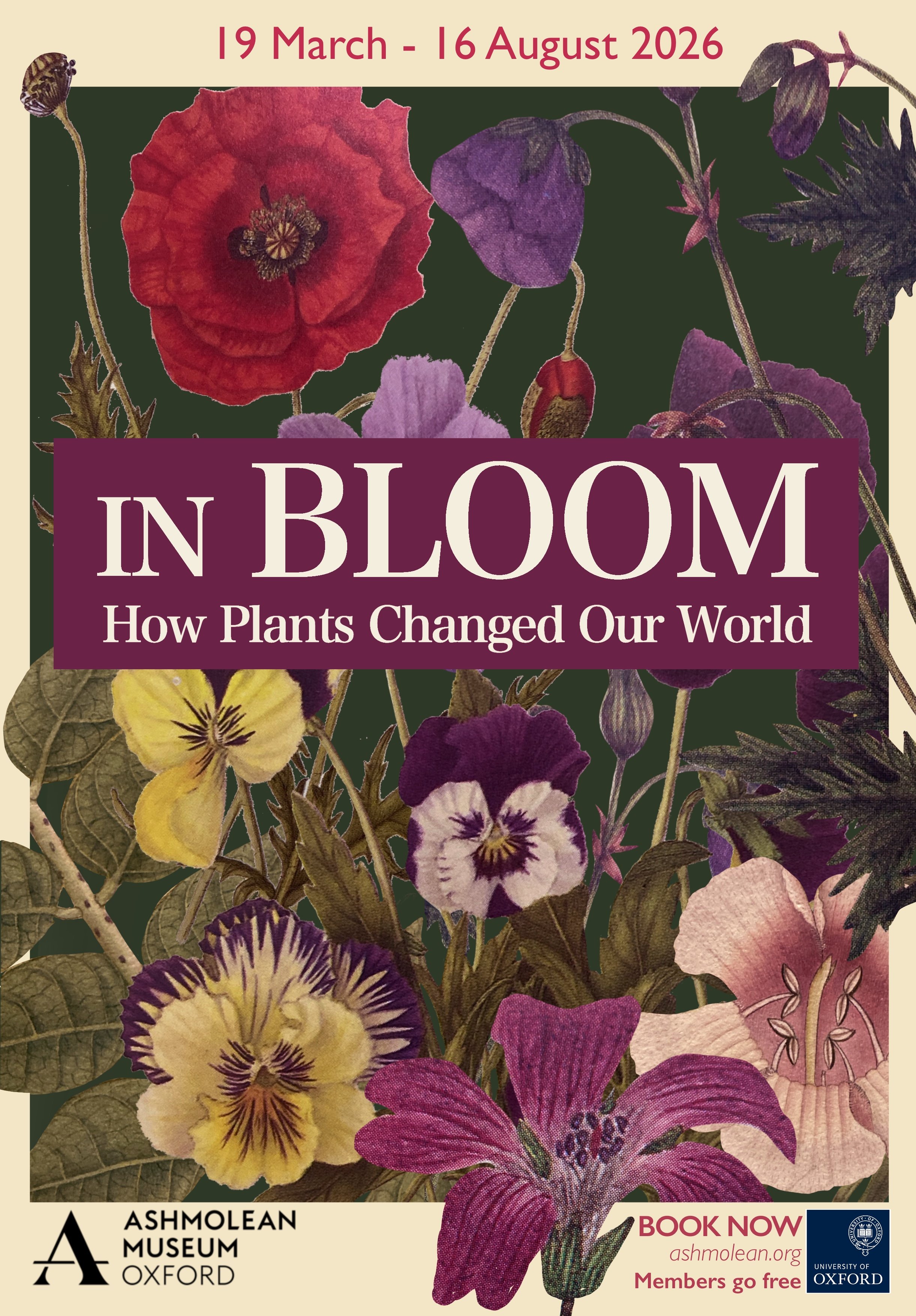
Poster design for the Ashmolean In Bloom exhibition
Having recently attended the wonderful exhibition at the Ashmolean museum in Oxford, I decided to have a go at recreating the posters. Being a keen botanist myself, I try to cultivate flowers and plants on my own balcony as well as indoors. I love the shadows they create, the organic beauty of how the petals fall, as well as the simple joy in looking at something natural but so beautiful.
The first design was inspired by the history and manuscripts created as part of botanical research, whereas the second plays on the original design but adds a more darker touch with some image manipulation to create shadows and depth, creating a more 3-dimensional touch to the flowers in the painting. The third design is very much inspired by the art of collage and the botanical illustrations found in various guides and botanical books. I wanted the poster to feel like it’s blooming, with various leaves and petals leaving the boundaries of the border. The colour palette being more muted in tone, much like older books would be, with slightly yellowed pages and the texture of the paper and the illustrations coming through.
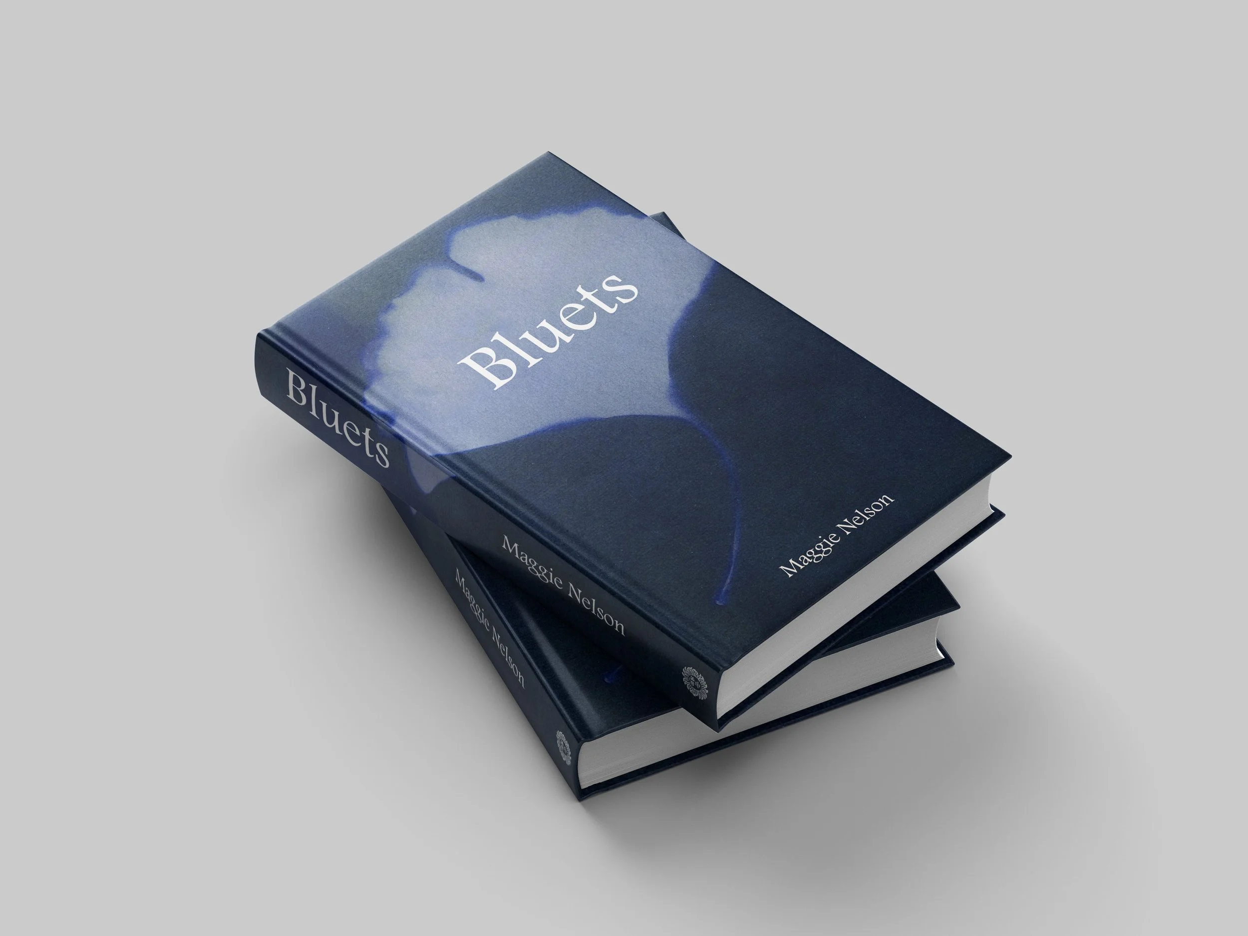
Covers
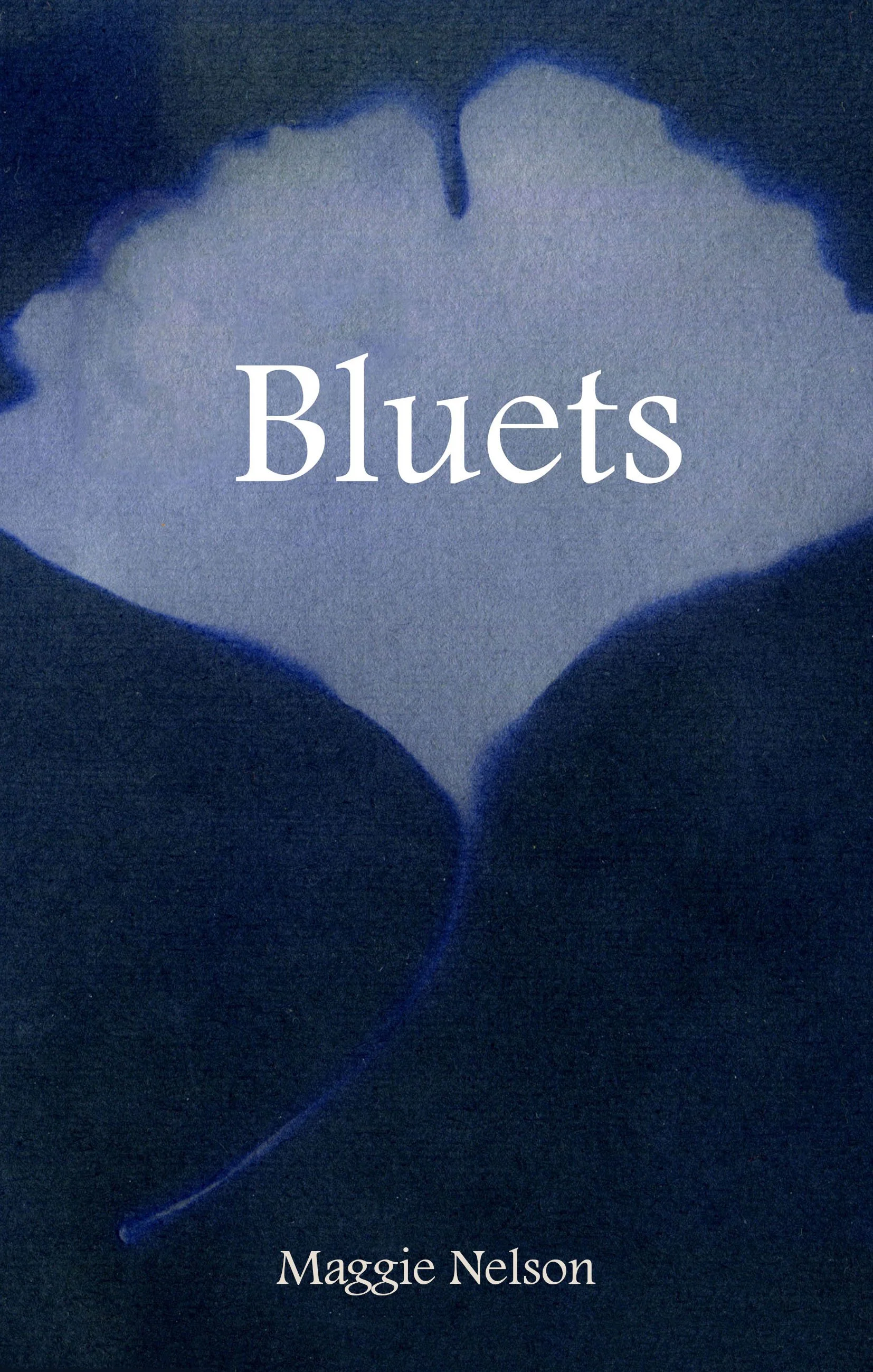
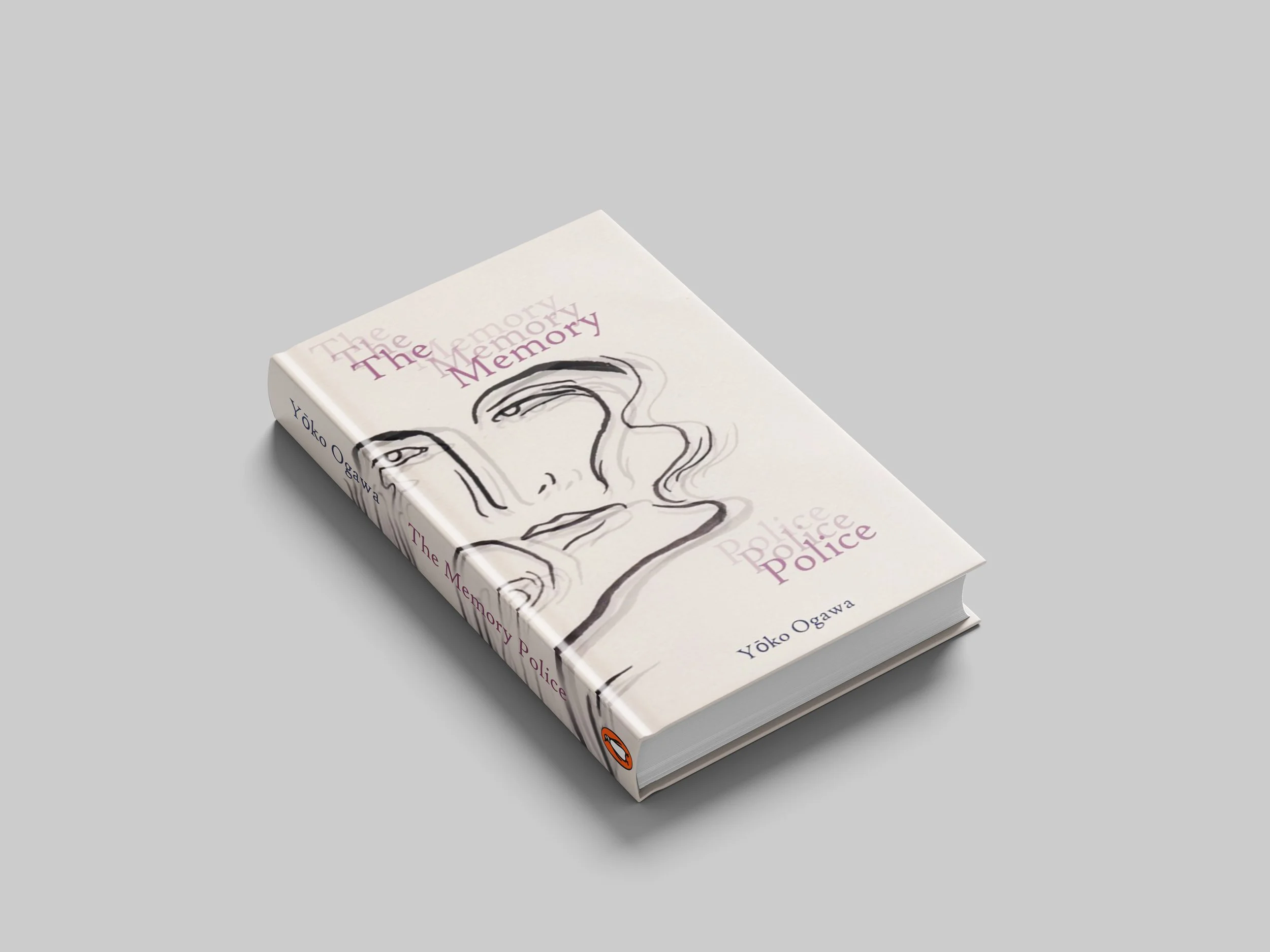
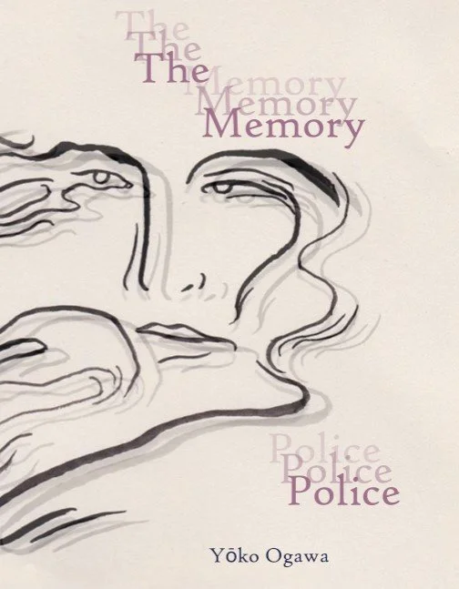
I was always drawn to book covers and great design. I love seeing how different countries and publishers approach cover design, and being a huge fan of fiction in translation (especially Literary Fiction) gives me a great opportunity to explore this. I grew up with beautifully illustrated eastern European children’s books and cultural remainders of what used to be fantastic Polish School of Posters. I loved making and creating art from a very young age, with the amazing support of my family. I still get so excited seeing a well designed advert, packaging, and cover. I guess that isn’t unusual, but having developed my practice as an illustrator, and then having the amazing opportunity to start my career in publishing has meant that I was itching to have a go myself. In my spare time I like to work on re-designing covers for some of my favourite books, trying to develop my graphic and visual communications skills, whilst putting my own illustration work in the context of a book cover. Below are some examples of cover ‘re-designs’ I created as part of a self-initiated project trying to expand my graphic communications skills.
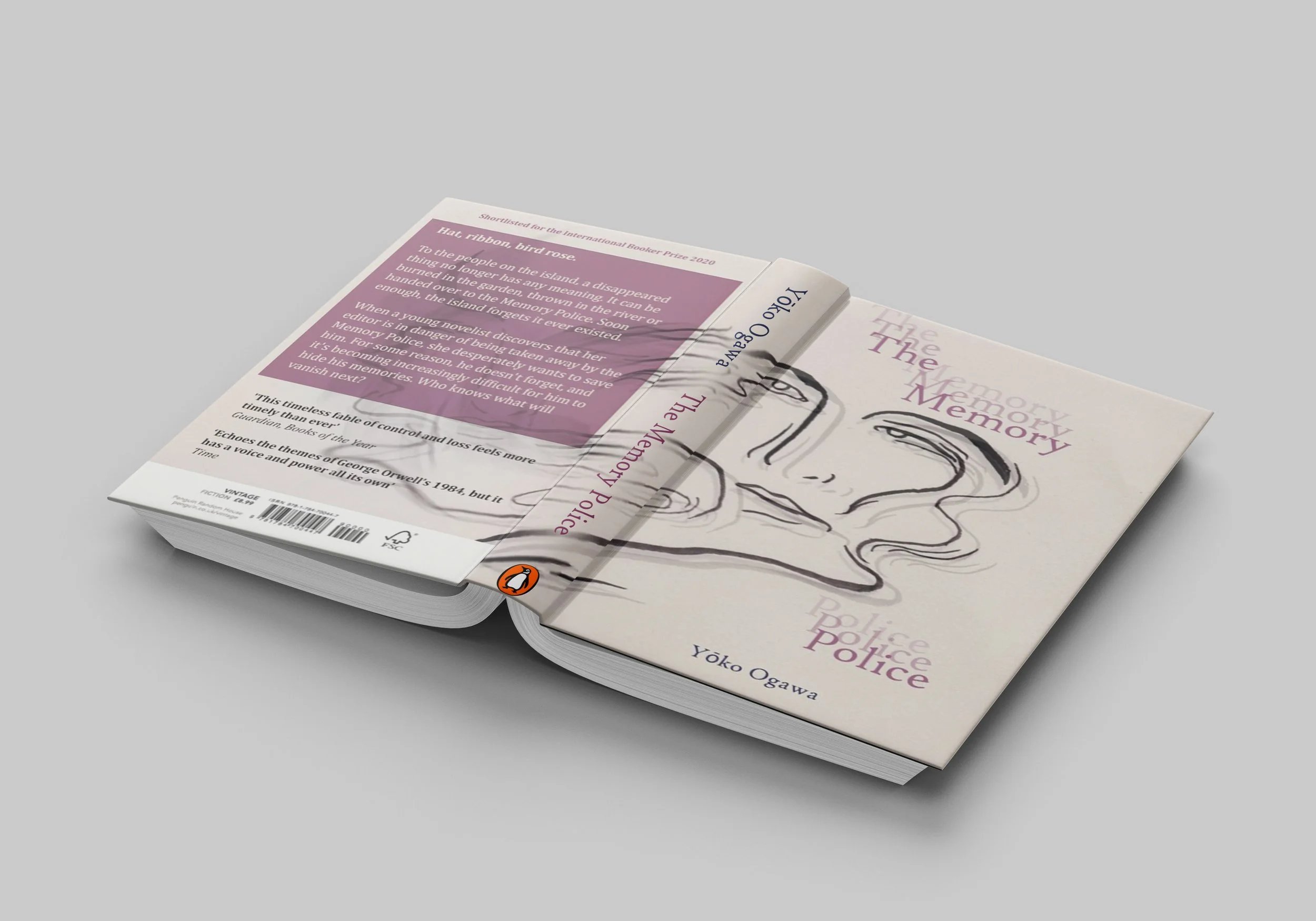
‘The Memory Police’ by Yōko Ogawa
‘On an unnamed island off an unnamed coast, objects are disappearing: first hats, then ribbons, birds, roses—until things become much more serious. Most of the island's inhabitants are oblivious to these changes, while those few imbued with the power to recall the lost objects live in fear of the draconian Memory Police, who are committed to ensuring that what has disappeared remains forgotten’
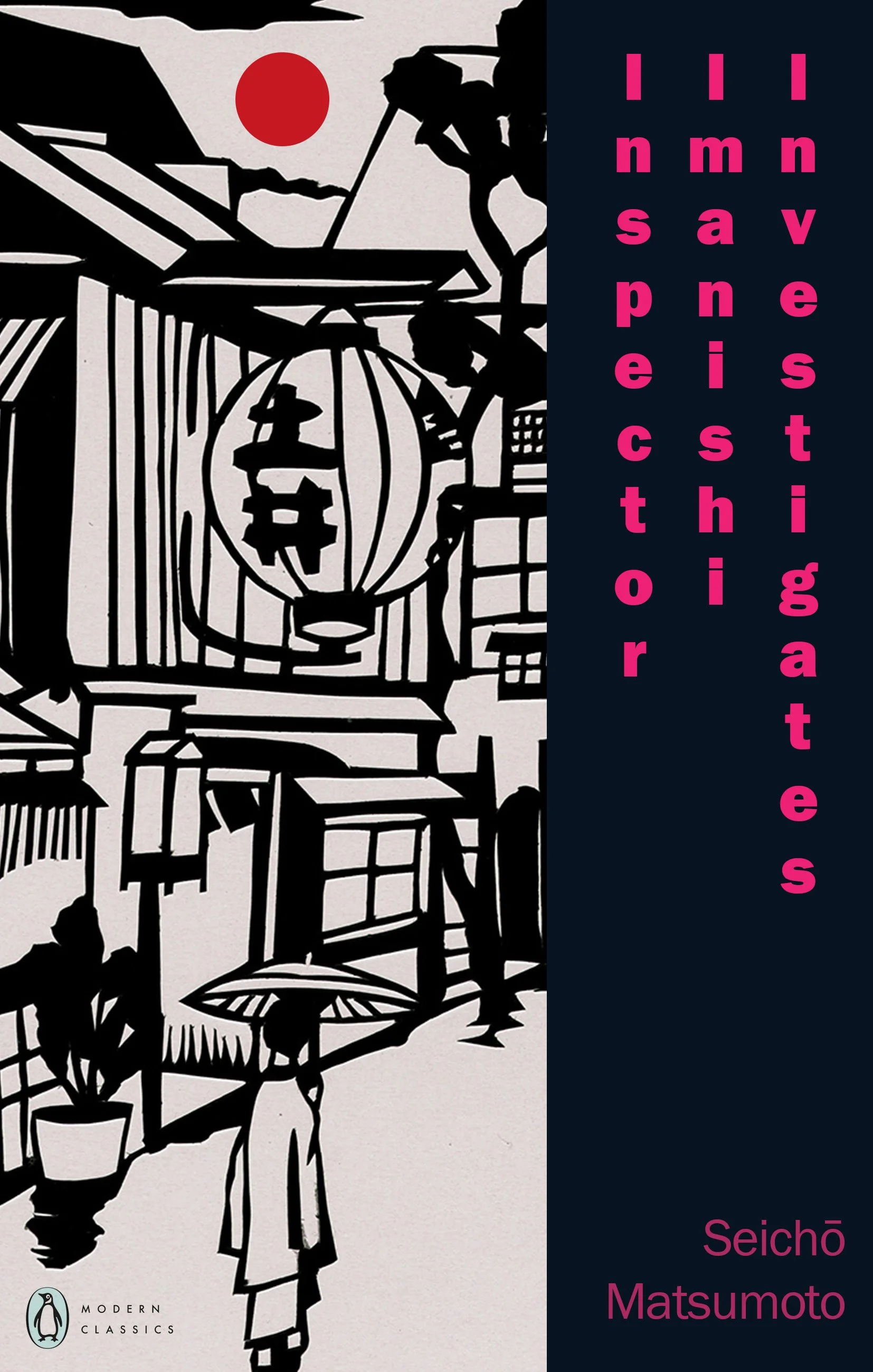

‘Inspector Imanishi Investigates’ by Seichō Matsumoto
‘Tokyo, 1960. As the first rays of morning light hit the rails at Kamata Station, a man’s body is found on the tracks. With only two leads – a distinctive accent and a single word, ‘kameda’ – Senior Inspector Imanishi Eitaro is called in to solve the puzzle. Setting aside his beloved bonsai and haikus, he must cross Japan in search of answers, from Osaka to Akita, accompanied by junior detective Yoshimura.’